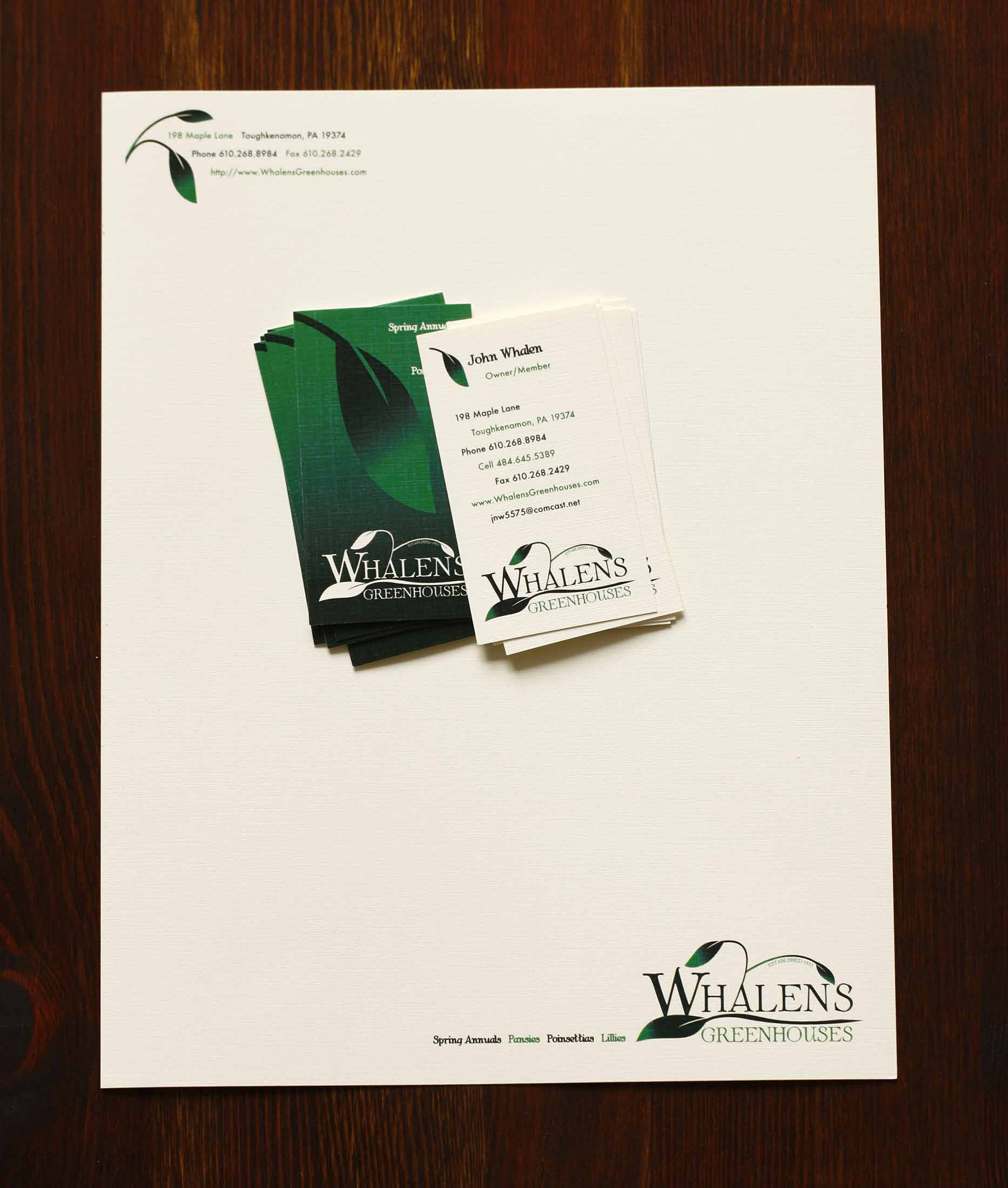
Whalen’s Greenhouses is a third-generation family-run horticulture business, selling plants and seeds for over 85 years. Their logo had a single leaf, but needed an update for a more current aesthetic.
SSC used a serif font for their name and manipulated each character slightly to fit the design. Inspired by the family name “Whalen’s”, SSC treated the leaves subtly to resemble water coming from a whale. The colors are dark and earthy greens and the leaves are intentionally non-descript. A natural linen stock suits the industry well.
“We have been working with Sarah for years and her creativity and attention to detail amazes us every time. She took our company logo and transformed it into a masterpiece that we are proud to put on all of our products. We can always count on Sarah to create any point of purchase needed quickly, with stunning results.”